Forum Settings
       
Reply To Thread

Amusement in the NewsFollow

#202 Mar 05 2009 at 2:53 PM Rating: Decent
Encyclopedia
******
35,568 posts
Jophiel wrote:
The graph I linked to is based off of the data that occured after 2001 (well, and before it). You'll notice that the data on my graph matches the projections on your chart.


But only for a couple years. That's the point. The actual data collected over the next 7 years did *not* match the projections. Get it?
____________________________
King Nobby wrote:
More words please
#203 Mar 05 2009 at 2:56 PM Rating: Good
Avatar
*****
13,240 posts
Quote:

My graph showed predictions going forward to 2100. That graph showed temperatures rising steadily during the entire time period.


By which I assume you mean exponentially. Right?

Quote:
The actual temperatures have not gone up significantly between 2000 and 2009. Thus, the graph I linked (with the predictions) did not match the actual data
Try syncing up your trend line graph with my more recent graph.
____________________________
Just as Planned.
#204 Mar 05 2009 at 3:14 PM Rating: Decent
Encyclopedia
******
35,568 posts
Sigh.

just one of many articles about temperatures in the last decade


I could probably find 50 more. You're pulling out selected data points, but not using them consistently. You can't compare one set of data to another that was collected using different methods. When you plot broad global temperature trendlines, they show a plateau effect over the last decade.


I've already pointed out how this calls into question global warming theory, and at the very least the need to spend massive amounts of money reducing CO2 emissions. Something *else* stopped the temperature increase that occurred during the previous 30ish years. CO2 emissions didn't change. Ergo, something else is having a larger effect on temperature than CO2 emissions. Something that the global warming models do not predict or account for.


That's why it's reasonable to question those models. They haven't accurately predicted temperature effects since they were adopted. It's easy to make a model fit historical data. But the proof is when they predict future data points. And so far, they haven't.
____________________________
King Nobby wrote:
More words please
#205 Mar 05 2009 at 3:20 PM Rating: Good
Vagina Dentata,
what a wonderful phrase
******
30,106 posts
This is why it is useless to argue with gbaji. He's discounting the research methods of leading climatologists. Ones who are far more qualified and knowledgeable all to fulfill his political ambition. He's full of sh*t. He's looking at a bunch of stuff as a layman. That's not worth that much. Like my medical treatment, I do tend to give more credibility to doctors than people on the internet.

Let's see those 50 citations--good, official, recent, peer reviewed studies proving your point. If you say you got it, gbaji, produce it.

Edited, Mar 5th 2009 6:21pm by Annabella
____________________________
Turin wrote:
Seriously, what the f*ck nature?
#206 Mar 05 2009 at 3:21 PM Rating: Excellent
Ministry of Silly Cnuts
*****
19,524 posts
gbaji wrote:
You're pulling out selected data points
Yes, but peer-reviewed ones.

Yours sre subjective mantrae

I rarely bother replying to your posts because you're such an annoying, bigotted, self-blinded, verbally-laxated dolt, but I'm in a good mood.
____________________________
"I started out with nothin' and I still got most of it left" - Seasick Steve
#207 Mar 05 2009 at 3:30 PM Rating: Decent
I bet Gbaji thinks global warming is a global Jewish Marxist Liberal conspiracy to seize power and turn the world into a single state.
#208 Mar 05 2009 at 3:31 PM Rating: Good
Vagina Dentata,
what a wonderful phrase
******
30,106 posts
Kavekk wrote:
I bet Gbaji thinks global warming is a global Jewish Marxist Liberal conspiracy to seize power and turn the world into a single state.


What's sad is that you are pretty much accurate. It's an evil plot for mean old Marxists to seize control of those innocent oil companies who just want to HELP PEOPLE.
____________________________
Turin wrote:
Seriously, what the f*ck nature?
#209 Mar 05 2009 at 3:31 PM Rating: Excellent
Ministry of Silly Cnuts
*****
19,524 posts
Kavekk wrote:
I bet Gbaji thinks global warming is a global Jewish Marxist Liberal conspiracy to seize power and turn the world into a single state.
Space aliens, stupid Smiley: rolleyes
____________________________
"I started out with nothin' and I still got most of it left" - Seasick Steve
#210 Mar 05 2009 at 3:34 PM Rating: Good
Baron von Annabella wrote:
Kavekk wrote:
I bet Gbaji thinks global warming is a global Jewish Marxist Liberal conspiracy to seize power and turn the world into a single state.


What's sad is that you are pretty much accurate.


I'm afraid I'll have to disagree, Anna. Me being right is never sad.
#211 Mar 05 2009 at 3:47 PM Rating: Excellent
Liberal Conspiracy
*******
TILT
Article wrote:
She replied: "No, actually, there has been cooling, if you take 1998 as your point of reference. If you take 2002 as your point of reference, then temperatures have plateaued. This is certainly not what you'd expect if carbon dioxide is driving temperature because carbon dioxide levels have been increasing but temperatures have actually been coming down over the last 10 years."
Yeah, if you pick the hottest year, it's gone down. If you pick some other year, it's leveled off. If you look at it from a long term perspective, like the sciencey folks do, there's a definate warming trend.
Gbaji wrote:
You're pulling out selected data points, but not using them consistently.
Smiley: laugh Ah, irony...
____________________________
Belkira wrote:
Wow. Regular ol' Joph fan club in here.
#212 Mar 05 2009 at 3:58 PM Rating: Good
Lunatic
******
30,086 posts

I could probably find 50 more.


Fuck, I could find 50 paid for by Exxon/Mobil alone.

What's your point? That there are people who will say or write things you agree with? Ok! Good to know. The overwhelming consensus among even marginally serious people who've spent time learning and doing actual science is the opposite of what you'd like (although who the fuck knows why, right, sucker?). I'd like the DMV to provide blowjobs while I wait in line to register my car. Yet, oddly, no matter how many people I pay to agree with me, it just doesn't happen.

That's just ridicule, ace, it's not a real metaphor.
____________________________
Disclaimer:

To make a long story short, I don't take any responsibility for anything I post here. It's not news, it's not truth, it's not serious. It's parody. It's satire. It's bitter. It's angsty. Your mother's a *****. You like to jack off dogs. That's right, you heard me. You like to grab that dog by the bone and rub it like a ski pole. Your dad? Gay. Your priest? Straight. **** off and let me post. It's not true, it's all in good fun. Now go away.

#213 Mar 05 2009 at 3:59 PM Rating: Decent
gbaji wrote:


My graph showed predictions going forward to 2100. That graph showed temperatures rising steadily during the entire time period.


Is this some new definition of "steady"? I'm sure it's a bit confusing to you since there are so many lines, but try to pick out any one. They are not steady in any conventional sense of the word. Nor has the historical record of Temperature.
#214 Mar 05 2009 at 4:01 PM Rating: Excellent
Liberal Conspiracy
*******
TILT
Ok... one more time, with hand puppets.

Here is a graph showing the models, created on/before 2001, and what they thought would happen over the next century. I have marked off the portion projecting 2000-2007 using the magic of math and a graphics program that tells me which pixel number I'm on. I also marked off 0.1 degree intervals:

Screenshot


Here is a graph, created after 2001 which shows the actual global temperatures between 1840 and 2007. The part we really care about is the 2000-2007 part since we're seeing how sharp those projections above were. I drew a baseline at the 2000 temperature. Note that "Zero" isn't the same on the two graphs since each measures "anomaly" from a different point but, for the temperature points themselves, we can see if the temperature went up or down using the same 0.1 degree interval lines for reference and using the same baseline at 2000.

Screenshot


Here are the two portions from 2000-2007 blown up. Unfortunately, the projection chart blows up to something of a mess even after you sharpen it a dozen times. Still, it gives an idea of what the projected temperature range was between 2000-2007 which we can compare to the actual range. Note also that the actual temperature chart starts from the 2000 baseline but it's more like a half interval to the first line:

Screenshot


The projections, if anything, undercut the first year or two a little and then are pretty much accurate for the next five years. Of course, this is speaking within a range since we're looking at eight different projections drawn on top of one another. Still, you'd have to be blind to deny that the projections accurately suggested a mild increase in global temperatures from 2000-2007.
____________________________
Belkira wrote:
Wow. Regular ol' Joph fan club in here.
#215 Mar 05 2009 at 4:14 PM Rating: Excellent
Liberal Conspiracy
*******
TILT
Free bonus: If you take the actual temperature data line and stretch it to make it (roughly) match the dimensions of the projection graph, you get this:

Screenshot


Not pretty, but if you want something nicer I'm going to need some government grant money.

Edit: I placed my lines wrong the first time I drew this and re-did it. The temperature data interval lines are approx. halfway between the projection lines due to the half-step thing I mentioned earlier. Anyway, this is more accurate.

Edited, Mar 5th 2009 6:30pm by Jophiel
____________________________
Belkira wrote:
Wow. Regular ol' Joph fan club in here.
#216 Mar 05 2009 at 4:21 PM Rating: Excellent
Lunatic
******
30,086 posts

Free bonus: If you take the actual temperature data line and stretch it to make it (roughly) match the dimensions of the projection graph, you get this:


Admit it, these are catsup stains.

____________________________
Disclaimer:

To make a long story short, I don't take any responsibility for anything I post here. It's not news, it's not truth, it's not serious. It's parody. It's satire. It's bitter. It's angsty. Your mother's a *****. You like to jack off dogs. That's right, you heard me. You like to grab that dog by the bone and rub it like a ski pole. Your dad? Gay. Your priest? Straight. **** off and let me post. It's not true, it's all in good fun. Now go away.

#217 Mar 05 2009 at 6:00 PM Rating: Default
****
4,158 posts
Quote:
Ok... one more time, with hand puppets.

Here is a graph showing the models, created on/before 2001, and what they thought would happen over the next century. I have marked off the portion projecting 2000-2007 using the magic of math and a graphics program that tells me which pixel number I'm on. I also marked off 0.1 degree intervals:

Screenshot
[ Report ]


Wow! You should get those guys to predict the movements in the stock-markets. They must have a pretty pukka crystal ball to be able to see the future movements of complicated systems in such an accurate way..........

I wonder if they all used the same climate prediction software/methods??? (..relatively serious question..)

Edited, Mar 6th 2009 6:14am by paulsol
____________________________
"If you have selfish, ignorant citizens, you're gonna get selfish, ignorant leaders". Carlin.

#218 Mar 05 2009 at 7:44 PM Rating: Decent
Encyclopedia
******
35,568 posts
I'm not sure how blowing the graph up does anything other than show in large dots how you're wrong.

Do any of the data points after the trendline equal or exceed the .1 line? No.

Out of the 6 points, how many come close? 1

Of the remaining 5, how many are near the halfway point? 2, 3 if you count that one that's kinda around the quarter mark.

Of the remaining 3, how many are down near the bottom? 2


Bonus question: Those two near the bottom. Are they the earlier points, or the later points? later points.


Do you see how this doesn't bode well? Plot a trendline through those following the same rules as the trendline on that graph up to that point, and you get a nearly flat line (a plateau if you will).

Tell you what. Go find me a graph generated that uses the same methodology, with new data for the years from 2002 through 2008 so we can stop guessing. For more bonus points explain why it is so hard to find such things on this wonderful thing called the internet.


And for the kicker:

Jophiel wrote:
Yeah, if you pick the hottest year, it's gone down. If you pick some other year, it's leveled off. If you look at it from a long term perspective, like the sciencey folks do, there's a definate warming trend


Wait. How does a choice between temperatures going down or leveling off equate to a "warming trend"? Not for the last decade, it doesn't. Trends change over time Joph. That's the point here.


There is no explanation in global warming theory for the temperature plateau we've seen in the last decade. None at all. That doesn't mean it's absolute garbage, but it should make one a little bit cautious about taking every prediction generated by those models at face value, let alone spending billions of dollars as a result.


It's not a zero cost argument here. It's not like if we do something and it turns out to be unnecessary that we've lost nothing in the process. If that was the case, I'd have no problem with global warming, and neither would anyone outside of academic circles. But there's an enormous cost involved in "fighting" global warming. Silly me. I want to have a bit more reason than "it might be bad" to go on here...


Heck. No one can promise me that even if the most dire predictions are true that *any* of the massive proposed costs will help at all. If the oceans are going to raise by 2 feet in the next century, and spending billions of dollars fighting CO2 emissions only reduces that by a half inch, well... I suspect we might have been better using that money doing something else. Like building boats maybe...
____________________________
King Nobby wrote:
More words please
#219 Mar 05 2009 at 8:49 PM Rating: Excellent
Liberal Conspiracy
*******
TILT
gbaji wrote:
I'm not sure how blowing the graph up does anything other than show in large dots how you're wrong.
Smiley: laugh Yeah, that's it. Luckily, most of the people reading these forums aren't as willfully ignorant as you.
Quote:
There is no explanation in global warming theory for the temperature plateau we've seen in the last decade. None at all.
Right. Except that the current temperatures fall right into the predicted range. In fact, if you average out the various predictions for the 2000-2010 range, you get -- hey, pretty much a plateau. In fact, if you choose any one of the predictions and average it for this decade you get -- hey, another plateau! Every single prediction shows a dip in temperature during the decade (the lighter colored lines earlier in and the darker ones later in the decade). If anything, the actual temperatures failed to return to the baseline as predicted which is a little worrisome.

I actually get what you're trying to say, it's just that you can't understand why it's not relevant against the rest of the charts.

Wow. Smiley: laugh

Edited, Mar 5th 2009 11:16pm by Jophiel
____________________________
Belkira wrote:
Wow. Regular ol' Joph fan club in here.
#220 Mar 05 2009 at 11:16 PM Rating: Good
Avatar
*****
13,240 posts
Quote:
Tell you what. Go find me a graph generated that uses the same methodology, with new data for the years from 2002 through 2008 so we can stop guessing. For more bonus points explain why it is so hard to find such things on this wonderful thing called the internet.


I linked you one from NASA.

Guess what?

It lines up with the predictions. Astonishing, no?
____________________________
Just as Planned.
#221 Mar 06 2009 at 12:45 AM Rating: Excellent
*****
15,952 posts
Screenshot


Read that whichever way you want to Smiley: lol.
#222 Mar 06 2009 at 2:12 AM Rating: Good
Alt text: Correlation doesn't imply causation, but it does waggle its eyebrows suggestively and gesture furtively while mouthing 'look over there'.

You have to post that with xkcd comics, young padawan. Much to learn, you have.
#223 Mar 08 2009 at 1:15 AM Rating: Excellent
*****
15,952 posts
Kavekk wrote:
Alt text: Correlation doesn't imply causation, but it does waggle its eyebrows suggestively and gesture furtively while mouthing 'look over there'.

You have to post that with xkcd comics, young padawan. Much to learn, you have.

I'm kind of not that sophisticated, sadly. Oh and I'm most definitely not an Anthropomorphic Climate Change skeptic. I just thought that that comic was like a mascot for the entire Asylum, and that this thread was the most Asylumesque thread going on at the time I wanted to post it.
#224 Mar 08 2009 at 2:43 AM Rating: Decent
There is an xkcd for every occasion. I have to restrain myself fom posting links to them soemtimes. Of course, about a third of new xkcds suck because Randall is being slowly corrupted by the internet, so it's generally the older ones.
#225 Mar 09 2009 at 10:06 AM Rating: Decent
Jophiel wrote:
Free bonus: If you take the actual temperature data line and stretch it to make it (roughly) match the dimensions of the projection graph, you get this:

Screenshot


Not pretty, but if you want something nicer I'm going to need some government grant money.

Edit: I placed my lines wrong the first time I drew this and re-did it. The temperature data interval lines are approx. halfway between the projection lines due to the half-step thing I mentioned earlier. Anyway, this is more accurate.

Edited, Mar 5th 2009 6:30pm by Jophiel


Thank you Jophiel for taking the time to post this. As has been confirmed through the course of this thread, gbaji makes claims totally at odds with reality and then posts something totally different in reply. However, some may be mislead by him and so I thank you for showing how totally wrong he is.
#226 Mar 09 2009 at 3:57 PM Rating: Decent
Encyclopedia
******
35,568 posts
Jophiel wrote:
Right. Except that the current temperatures fall right into the predicted range. In fact, if you average out the various predictions for the 2000-2010 range, you get -- hey, pretty much a plateau.


No, you don't. The projections show as you stated, about a .1 degree temperature change over that decade.

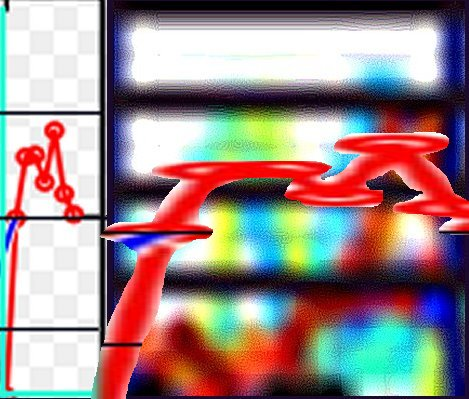
The problem isn't with that part though. The problem is with your 2000 "baseline" in the chart right underneath it. The one you then go on to blow up massively to try to make a point.

You placed the 2000 baseline on a very low outlier data point, while ignoring the 5 year average trendline. If you place it *on* the trendline, and then look at where the trendline continues from there (so we're ignoring outliers, like 1998, which had a very high temperature, and 2000, which had a very low one), we find that the net temperature increase over the next few years is microscopic. It's a very very clear slope change from the preceding couple decades.


That's what you seem to be ignoring. The projections of gloom and doom are based on assumptions/predictions that global temperatures will continue to rise at the same or higher rate that it's risen for the last 2-3 decades. If you look at the projections, the lowest of them continue on a more or less straight slopped line, while many of them show an increased slope over the next century (90 years now).

The relevance of the plateau in temperatures is that the predictions of gloom and doom are based on the higher predictions, not the lower ones. Pointing at a couple projections which don't show much increase in the first decade of the century and saying "See! That's what they predicted" isn't that relevant.

Quote:
In fact, if you choose any one of the predictions and average it for this decade you get -- hey, another plateau! Every single prediction shows a dip in temperature during the decade (the lighter colored lines earlier in and the darker ones later in the decade).


Only if you kinda squint hard and see only what you want to see. The predictions are color coded, but by prediction source/methodology. While all of them show dips and ridges, they *all* show the trend going upwards, even when we just look at the first decade.

Look at the blue trendline Joph. That's the 5 year average. That's the line I'm talking about. And that number has absolutely gone up at a pretty steep slope for about 30 years prior to 2000, and then shallowed significantly in the next 8 years. That's the plateau everyone is talking about. It is *not* predicted by global warming theory. The entire argument for spending billions of dollars reducing CO2 emissions rests on the assumption that a plateau would not happen and that temperatures would continue to rise as they had in the previous decades. You can play games with this set of projections, or that set of measurements, but the policies we're talking about don't make sense given the data we're now seeing.


Quote:
I actually get what you're trying to say, it's just that you can't understand why it's not relevant against the rest of the charts.


Because what's relevant is which predictions are used to justify that political actions global warming activists want us to take, and the fact that those predictions do not appear to match the data. Everything else is static. It doesn't matter.
____________________________
King Nobby wrote:
More words please
Reply To Thread

Colors Smileys Quote OriginalQuote Checked Help


Recent Visitors: 226 All times are in CST
Anonymous Guests (226)