gbaji wrote:
Lol. That value is an outlier.
It doesn't matter, really. In 2000, scientists predicted where the temperature would be going from 2000 onwards. In 2009, we can look at the temperature from 2000-2007 and see that, yup, it went where the scientists predicted. In 2000, the average temperature could have been 3 degrees with the entire planet an icy ball and it still wouldn't matter except that there'd be a much larger jump between 2000 and 2001. So long as the actual temperature matches what the projection was, it's accurate. Put your finger over the left edge of the graph if it bothers you to look at it, it won't change that the 2001 temperature anomaly was 1.5 intervals higher than the 2000 temperature anomaly.
Each red circle shows how many degrees above the 2000 temp we were from year to year. The multicolored lines show various predictions of where it was expected we'd be. The red lines more or less flatten out. If you were to draw the blue line through them, it'd be a plataeu as you said. However, averaging the various predictions, each of them winds up with an average global temperature for the period of approximately the same temperature.
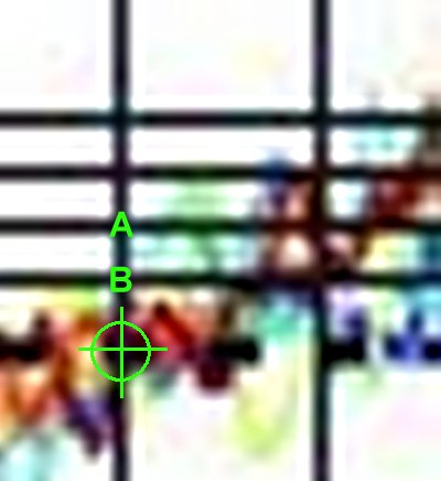
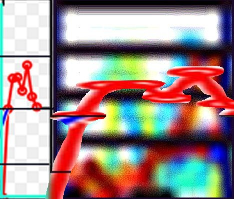
The green crosshairs show the Y2000 temperature. I didn't add the other line because I'm trying to keep it clean but it peaked above the A line for reference. The trendline, if it were to be continued, would sit right above the A line. The average temperature for the various predictions would sit just below the A line (owing mainly to the fact that scientists predicted a decrease in temperatures to Y2000 levels at some point between 2000-2007 which didn't happen). For example, the green line goes from the 2000 baseline to the interval above A, back down to Y2000 and then, in 2007, hits the B interval. The average temperature for that period being between A & B. The dark red line goes from Y2000, almost up to B, back
below the baseline, up to the third interval and then almost to Interval B. Again, if those were the actual temperatures and you plotted a baseline through there, you'd wind up with a fairly flat line between A & B, raising up slightly towards the end. Yellow is worse, ending in a flat line that doesn't even reach the B line. However, taken in aggregate, you wind up with a pretty flat line along the B interval. The reality was a fairly flat line along the A interval (owing, yet again, to a failure to cool to Y2000 levels).
What's going on now isn't any surprise. You keep insisting that it is but... well, it's not. I can't explain it any better than that. I'd ask you to perhaps find some scientific papers expressing shock at how this "unexplainable" temperature pattern is occuring but I think we both know that you'll do no such thing.
Quote:
Tell you what. Take both graphs (measured temperatures and the projections), and instead of using 2000 as the baseline, use 1998. Do the exact same process you used for the 2000 baseline comparison.
OMG! Global Cooling! Or... How to lie with graphs.
Yeah, see, this is what you can't understand. I'm not using the graphs to prove that it's
warming per se. I'm using them to show that the current temperature trend wasn't unexpected and was, in fact, predicted (in a general sense). Starting from 1998 wouldn't change that. However, given that the prediction graphs start from 2000/2001, it wouldn't make much sense.
Now, the
next ten year period shows a definite warming spat, even allowing for averaging. If things aren't warmer in 2019, let me know.
Edited, Mar 10th 2009 1:04am by Jophiel