
This is just a rough draft. And it needs some work. Going for an effect similar to this:
http://www.popartuk.com/g/l/lgst2792.jpg
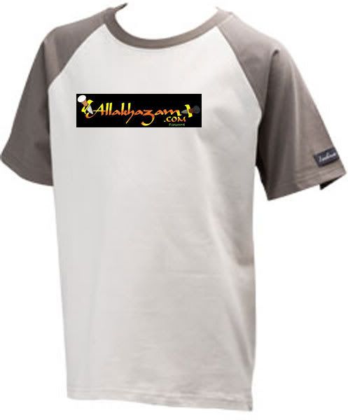
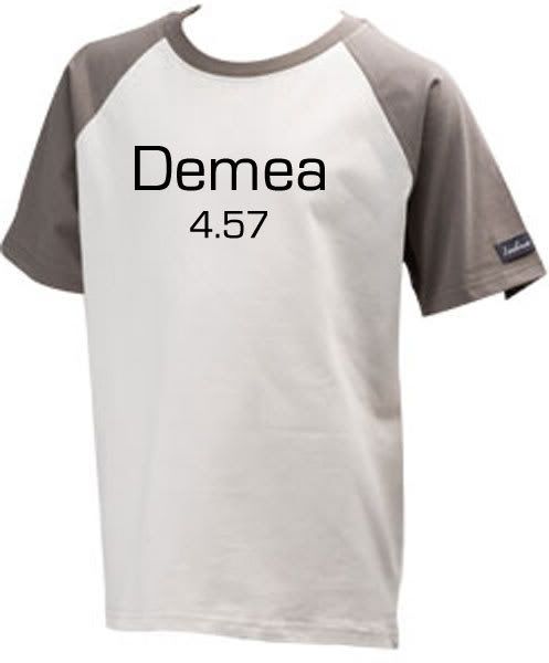
[img]http://swg.allakhazam.com/kd/asylumshirt.jpg[/img]
- Forums
- Cross Site
- The Asylum
- rough draft potential Asylum T-shirt
rough draft potential Asylum T-shirtFollow
Arch Duke Kaolian Drachensborn, lvl 95 Ranger, Unrest Server
Tech support forum | FAQ (Support) | Mobile Zam: http://m.zam.com (Premium only)
Forum Rules
Tech support forum | FAQ (Support) | Mobile Zam: http://m.zam.com (Premium only)
Forum Rules
              A S Y L U M


In =4, everyone can tell you to GFY.
Something like that for the text?
Sold, i'll take 2 in medium.
I like.
Better than that Wizard-image one posted in =3, at least.
Better than that Wizard-image one posted in =3, at least.
Proud citizen of Miranda.
-Currently on Pochacco Server of Hello Kitty Online.
-Currently on Pochacco Server of Hello Kitty Online.
The logo should be embroidered on the right chest area, and the rest should go on the back. That would make this a good design.
Elderon wrote:
The logo should be embroidered on the right chest area, and the rest should go on the back. That would make this a good design.
Bingo!
publiusvarus wrote:
we all know liberals are well adjusted american citizens who only want what's best for society. While conservatives are evil money grubbing scum who only want to sh*t on the little man and rob the world of its resources.
what about using someone in a straight jacket instead of some hurricanish pic? Something like this or maybe this? There is also the pic used from Ogame that I loved, which would work perfectly
edited to add another motto thought:
Go ahead and scream... we like it
Edited, May 5th 2007 11:34pm by DSD
edited to add another motto thought:
Go ahead and scream... we like it
Edited, May 5th 2007 11:34pm by DSD
I love it Kao!
Btw, the image we use has to be either the property of Kao or royalty free, otherwise we might get into trouble for using it.
Btw, the image we use has to be either the property of Kao or royalty free, otherwise we might get into trouble for using it.
Whoever is doing your design work (both for Tees and for the site) needs to be fired.
Seriously, I know nerds are not the most fashion savvy of folks but really, this is pretty bunk. Less bunk than the one shown on forum=3, but still pretty f'ucking bunk.
Seriously, I know nerds are not the most fashion savvy of folks but really, this is pretty bunk. Less bunk than the one shown on forum=3, but still pretty f'ucking bunk.
Bode - 100 Holy Paladin - Lightbringer
Yeah, the other one: http://artworks.avalonweb.net/excellence/asylum.jpg would need to get permission for use. This one was based of a historical photograph taken by a city government of their asylum, therefor we can use it.
Arch Duke Kaolian Drachensborn, lvl 95 Ranger, Unrest Server
Tech support forum | FAQ (Support) | Mobile Zam: http://m.zam.com (Premium only)
Forum Rules
Tech support forum | FAQ (Support) | Mobile Zam: http://m.zam.com (Premium only)
Forum Rules
I did this one. I dunno. I think i've seen worse out there. By all means, if you have a better one, step up to the plate and submit one. Or maybe offer some other constructive critisizm besides "f'ucking bunk"
Arch Duke Kaolian Drachensborn, lvl 95 Ranger, Unrest Server
Tech support forum | FAQ (Support) | Mobile Zam: http://m.zam.com (Premium only)
Forum Rules
Tech support forum | FAQ (Support) | Mobile Zam: http://m.zam.com (Premium only)
Forum Rules
I like it except for the placement of the Allakhaazam logo. I imagine where it cuurently is it would draw extra attention to my waist, and then to my crotch-groinal area and-
Oh ****, nevermind, I like it!
Honestly, though, I think it's fine but I would move the logo. Either like the layout Eldy suggested or if this is the front of the shirt move it to the upper-back. It's a bit busy otherwise.
Oh ****, nevermind, I like it!
Honestly, though, I think it's fine but I would move the logo. Either like the layout Eldy suggested or if this is the front of the shirt move it to the upper-back. It's a bit busy otherwise.
eh.
too much IMO.
I'm thinking like the little Allakhazam Asylum logo on the front left breat of the shirt with the huge letters "GFY" or "ESAD" or any other commonly over-used internet euphemisms.
too much IMO.
I'm thinking like the little Allakhazam Asylum logo on the front left breat of the shirt with the huge letters "GFY" or "ESAD" or any other commonly over-used internet euphemisms.
Shouldn't there be a comma after "here"?
I like it!
In a time of universal deceit, telling the truth is a revolutionary act.
trickybeck wrote:
Shouldn't there be a comma after "here"?
There isn't one on the aliens poster I modeled it after. Grammatically, it probably should have one. But in this case i'm going to leave it off.
Arch Duke Kaolian Drachensborn, lvl 95 Ranger, Unrest Server
Tech support forum | FAQ (Support) | Mobile Zam: http://m.zam.com (Premium only)
Forum Rules
Tech support forum | FAQ (Support) | Mobile Zam: http://m.zam.com (Premium only)
Forum Rules
Hmm.. i'll ask my brother if he will make a design for you he's actually really good with computer art.
Ahhh so you wish for me to illustrate how it is f'ucking bunk and give alternatives!
First off lose the graphic. It is too large, it is ugly and it draws attention away from everything else on the shirt. As others have REPEATEDLY mentioned in both of the 'T-shirt' threads, keep it f'ucking simple.
Give me a t-shirt with a couple different colours choices, give me the 'Allakhazam' dagger logo at a decent size on the left breast. This will do to start. If you wish to take it from there and start putting more text such as 'forum=4'. 'gfy' etc then do so but please have someone who has designed a t-shirt before do it for you. If you feel the need to add a graphic keep it simple, keep it relevant, make it a symbol or perhaps something identifiable such as WoW tee's having a Horde insignia on the front rather than a picture of a raging orc. One is a cool pattern that those in the know will recognize, the other is a big *** picture announcing ones nerdliness to the world and will ensure enforced celibacy for the wearer.
Edited, May 7th 2007 9:06am by bodhisattva
Bode - 100 Holy Paladin - Lightbringer
I like the graphic. I agree it shouldn't be right there with the logo, especially since the colors kinda clash with it.
Put the graphic on the back, put the logo, smaller than shown here, on the front. Upper left is good.
Put the graphic on the back, put the logo, smaller than shown here, on the front. Upper left is good.
In a time of universal deceit, telling the truth is a revolutionary act.
Samira wrote:
I like the graphic. I agree it shouldn't be right there with the logo, especially since the colors kinda clash with it.
Put the graphic on the back, put the logo, smaller than shown here, on the front. Upper left is good.
Put the graphic on the back, put the logo, smaller than shown here, on the front. Upper left is good.
Yes, and I'll take four: 2 small, 1 - X large, and one 2X.
Put a comma after "here" and enlarge that text and I'd consider it. The pic probably needs to be smaller too.
Meh.
Should be, in here, everyone can see you scream.
And drop the Forum=4. Should just be =4.
Should be, in here, everyone can see you scream.
And drop the Forum=4. Should just be =4.
Bonus points if we can get custom made jerseys or baseball shirts with our poster name and karma score on the back. It could be the official apparel of Allanois '07!
Jophiel wrote:
I managed to be both retarded and entertaining.
Mr Winky thinks any choice should include a polo version with his face as the buttons.
I'm trying to talk him out of it.
I'm trying to talk him out of it.
In a time of universal deceit, telling the truth is a revolutionary act.
Elderon wrote:
The logo should be embroidered on the right chest area, and the rest should go on the back. That would make this a good design.
/nod
maybe also take off the forum=4 and just put =4 on one or both of the sleeves. Make it white text not that greenish color.
Recent Visitors: 281
All times are in CST
Anonymous Guests (281)
- Forums
- Cross Site
- The Asylum
- rough draft potential Asylum T-shirt
© 2024 Fanbyte LLC