Forum Settings
       
Reply To Thread

Forum upgrade - Public beta previewFollow

#77 Jun 24 2011 at 6:53 PM Rating: Excellent
Avatar
******
29,919 posts
Lubriderm Quick Hands wrote:
I'm having issues rating. There is either mega lag or I have to click an arrow several times to get a rate to take effect. Once I do it for one post on a page, though, the any other rates will take place with one click.

Windows 7; firefox 3.whateverIsCurrent


There is a slight issue with the dev server the forum test is on. that should be resolved shortly.
____________________________
Arch Duke Kaolian Drachensborn, lvl 95 Ranger, Unrest Server
Tech support forum | FAQ (Support) | Mobile Zam: http://m.zam.com (Premium only)
Forum Rules
#78 Jun 24 2011 at 6:53 PM Rating: Good
Screenshot


This little feature kicks ***.
#79 Jun 24 2011 at 6:57 PM Rating: Good
*******
50,767 posts
Something I just noticed while playing with the images of Raptor Jesus. If you edit a post, then edit it slightly differently, then go back to the first edit you're given a "We've detected a Duplicate Post" error. I'm sure its a rare situation, but since we are beta testing.
____________________________
George Carlin wrote:
I think it’s the duty of the comedian to find out where the line is drawn and cross it deliberately.
#80 Jun 24 2011 at 6:58 PM Rating: Excellent
Webmonkey
ZAM Administrator
**
710 pandas
lolgaxe wrote:
JerekDain wrote:
lolgaxe wrote:
I just want to second the request for the option to "Hide Youtube Videos," like you can signatures and avatars/pictures. I do like the auto-open Quick Reply option, though.
The option to hide images and avatars now turns embedded YouTube videos in to links.
Can we suggest that they be separate options?

That may be good. We can add that after launch though.

lolgaxe wrote:
And a quick follow up, immediately after I posted the whole thread vanished except the Quick Reply box. Will edit in picture after this post.

Edit: It hasn't happened again, so might have been some weird fluke. Still felt should be mentioned, just in case.

This was from some changes we were making. It should be good now.

Dread Lörd Kaolian wrote:
shintasama wrote:
Do non-premiums get img folders or are we stuck piggybacking on premium member's folders lolgaxe?


I think the intent is to give non premiums image upload folders, but possibly with a cap on the size of the upload folder. I'm not certain that will be ready at launch.

Piggybacking for now. In the future is still being determined I believe.

Lubriderm Quick Hands wrote:
Is there a guesstimate as to when this will be live officially?

Very soon.

Lubriderm Quick Hands wrote:
I should have taken a pic, but didn't think of it, but when I make a post that is a multiple of 50 for the thread I end up in some nil page. It's like it wants to go the next page but there are no posts on it yet.

Thanks for the report, I'll see what I can do.
#81 Jun 24 2011 at 7:01 PM Rating: Good
Can we get [blink] too on a 'you abuse it, you lose it' basis? Maybe just for premium?

Oh, did anything happen with Smiley: cake yet?
#82 Jun 24 2011 at 7:14 PM Rating: Excellent
The BBCode on my bio isn't working.
____________________________
Kaolian wrote:
After a horrific accident involving a radioactive housecat, Davejohnsan becomes “THE CAT YODALER!” By day, mild mannered veterinary supplies salesmen, but by night, daemon feline scourge of the swiss alps! Swiss cheese production falls sharply in the first quarter as lack of sleep slowly drives everyone in Switzerland insane
#83 Jun 24 2011 at 7:15 PM Rating: Good
Ghost in the Machine
Avatar
******
36,443 posts
Dread Lörd Kaolian wrote:
They should be there, Are you not seeing the "forum" link breadcrumbs under the names at the bottom on the skin you are looking at? or are you referring to a different button?


Bahaha, I hadn't noticed that one. Thanks.

Could stand to be a slightly larger, but I'd really prefer a "Thread index" button of some kind. I'm talking about the current "Thread Index" link that takes you to the thread overview of that forum. I get that it's redundant with the breadcrumb system, but the first thing I learned in webdesign was to always put a "back" button on the page, no matter how redundant it might seem. That way, if someone gets lost and confused, they can always hit that button and know where it'll take them.

I'd be okay with a larger font size, though. My fine motor skills blow.
____________________________
Please "talk up" if your comprehension white-shifts. I will use simple-happy language-words to help you understand.
#84 Jun 24 2011 at 7:18 PM Rating: Good
Nothing big, but I did prefer recent visitors at the top as opposed to the bottom.
#85 Jun 24 2011 at 7:18 PM Rating: Good
*******
50,767 posts
When trying to go to a different forum using the drop downs, youtube videos disappear.
____________________________
George Carlin wrote:
I think it’s the duty of the comedian to find out where the line is drawn and cross it deliberately.
#86 Jun 24 2011 at 7:29 PM Rating: Excellent
Webmonkey
ZAM Administrator
**
710 pandas
Lubriderm Quick Hands wrote:
I should have taken a pic, but didn't think of it, but when I make a post that is a multiple of 50 for the thread I end up in some nil page. It's like it wants to go the next page but there are no posts on it yet.

Fixed.

Davejohnsan wrote:
The BBCode on my bio isn't working.

Bios don't currently support BBCode. They may in the future, but not right now.

lolgaxe wrote:
When trying to go to a different forum using the drop downs, youtube videos disappear.

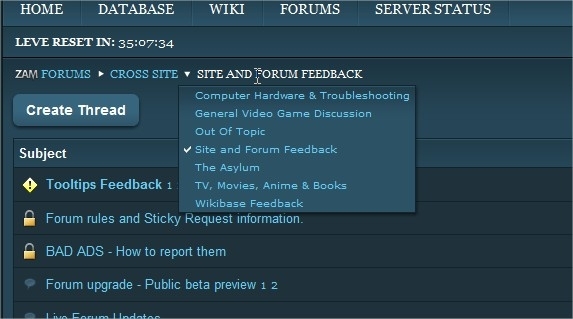
This is intentional, so that the path dropdowns don't go behind the YouTube videos.
#87 Jun 24 2011 at 7:46 PM Rating: Decent
***
1,609 posts
Tried changing my avatar via my iPhone and it's not saving the setting. Keeps defaulting to no avatar
#88 Jun 24 2011 at 7:49 PM Rating: Decent
***
1,609 posts
Hmm. Odd. I do have an avie but when I went to my profile to hnage it there was nothing saved.
#89 Jun 24 2011 at 8:44 PM Rating: Good
Avatar
****
4,580 posts
Everquest preview of the forum changes looks great. All the changes listed sound like progress to me at this point too.

Well done to all who are working on this, and thanks for keeping EQ in our old-school browns (beiges?).
#90 Jun 24 2011 at 8:55 PM Rating: Excellent
Live Preview doesn't work from http://wow.forumtest.allakhazam.com/uposts

It does from the live skin, though.

Edited, Jun 24th 2011 7:56pm by Davejohnsan
____________________________
Kaolian wrote:
After a horrific accident involving a radioactive housecat, Davejohnsan becomes “THE CAT YODALER!” By day, mild mannered veterinary supplies salesmen, but by night, daemon feline scourge of the swiss alps! Swiss cheese production falls sharply in the first quarter as lack of sleep slowly drives everyone in Switzerland insane
#91 Jun 25 2011 at 1:09 AM Rating: Decent
@#%^ing DRK
*****
13,143 posts
Needs more numbers.

Looks great so far. I too very much like the hover over feature for more forums.
#92 Jun 25 2011 at 2:17 AM Rating: Decent
**
952 posts
I like it so long as I get to keep the dark background. Overly bright backgrounds make my eyes bleed.
#93 Jun 25 2011 at 2:50 AM Rating: Good
****
5,729 posts
Slightly edited repost from the thread in the WoW general forum because it was suggested that I do so:

Please give us the option to keep using the current skins if we want to. I could learn to live with the new one if absolutely necessary but I MUCH prefer the existing one. It's cleaner and simpler, and that's key when it comes to forums IMO. I'm not here to admire the shiny buttons and borders and sidebars. I'm here to read posts.

All the buttons and stuff are brighter and more vivid and... bubbly... and the actual content of the posts seems to get lost in it all. Please let us continue using the current, cleaner (IMO) version if we want.


Other stuff:
I'd consider moving the post rating back down under the avatar with the rest of the poster info. Right now that one bit of information is off on it's own and is easily missable.

Also, guru and admin names are hard to read on the new WoW skin because of the color contrast on the new side bars.
____________________________
75 Rabbit/75 Sheep/75 Coeurl/75 Eft/75 Raptor/75 Hippogryph/75 Puk
75 Scorpion/75 Wamoura/75 Pixie/75 Peiste/64 Sabotender
51 Bird/41 Mandragora/40 Bee/37 Crawler/37 Bat

Items no one cares about: O
Missions no one cares about: O
Crafts no one cares about: O
#94 Jun 25 2011 at 6:23 AM Rating: Good
Avatar
***
1,369 posts
I like the new look and features, particularly the post preview pane on mouseover. However, this same feature is causing me a world of misery when browsing the forum from a tablet. Is it possible to disable mouseover features on mobile (or unrecognized) browsers to prevent this?
____________________________

#95 Jun 25 2011 at 7:09 AM Rating: Excellent
*****
13,251 posts
I agree with separate options for hiding Avatars, Images, and Videos. Maybe if you have just a catch-all checkbox on the forum page, but allow us to specify from our User Control Panel, it would work. I happen to like avatars in general, but I see myself blocking the YouTube videos fairly quickly, and perhaps the images too since everyone will be able to post them.
#96 Jun 25 2011 at 7:10 AM Rating: Good
*****
13,251 posts
Samatman wrote:
I like the new look and features, particularly the post preview pane on mouseover. However, this same feature is causing me a world of misery when browsing the forum from a tablet. Is it possible to disable mouseover features on mobile (or unrecognized) browsers to prevent this?
There's a mobile skin at m.zam.com, but I don't know if they have the new forum preview set up for it.
#97 Jun 25 2011 at 7:22 AM Rating: Good
Ghost in the Machine
Avatar
******
36,443 posts
Is there any way to reduce the size of the video preview in posts? Currently they're huuuuge and sort of take up the entire screen, meaning your scrolling action comes to a sudden halt the moment you scroll onto one.

Edit: The bottom breadcrumb thing doesn't have mouse-over effects.

Edited, Jun 25th 2011 3:38pm by Mazra
____________________________
Please "talk up" if your comprehension white-shifts. I will use simple-happy language-words to help you understand.
#98 Jun 25 2011 at 8:47 AM Rating: Good
***
2,346 posts
This is probably pretty little, and maybe only bothers me but the quote box on wow classic doesn't feel distinguished enough from the rest of the post. If you kept the quote box dark but kept the rest of the post lighter, like on the left hand side with the username and stuff I think it would help out.

Just a thought.
#99 Jun 25 2011 at 9:34 AM Rating: Excellent
*****
14,454 posts
I only quickly skimmed so I apologize if this was already answered but I noticed a follow button. Does that mean if we check that we could conceivably get emails letting us know if there have been more posts? Cause that would be cool!
#100 Jun 25 2011 at 9:49 AM Rating: Good
Avatar
***
1,369 posts
Spoonless the Silent wrote:
There's a mobile skin at m.zam.com, but I don't know if they have the new forum preview set up for it.

Thanks, I didn't know there was a mobile version. Oddly enough, when I try it, I get a message that that page is only available to premium subscribers.
____________________________

#101 Jun 25 2011 at 10:24 AM Rating: Excellent
Liberal Conspiracy
*******
TILT
Samatman wrote:
Thanks, I didn't know there was a mobile version. Oddly enough, when I try it, I get a message that that page is only available to premium subscribers.

That's because the mobile stylesheet is ad-less so it's only available to premium users.
____________________________
Belkira wrote:
Wow. Regular ol' Joph fan club in here.
Reply To Thread

Colors Smileys Quote OriginalQuote Checked Help


Recent Visitors: 16 All times are in CST
Anonymous Guests (16)